En este artículo, aprenderemos cómo agregar un menú de opciones personalizado a cualquier elemento de tu aplicación, como por ejemplo, botones.
Para lograrlo, utilizaremos JavaScript, HTML y CSS, combinando estos tres lenguajes para crear una interfaz interactiva y estilizada.
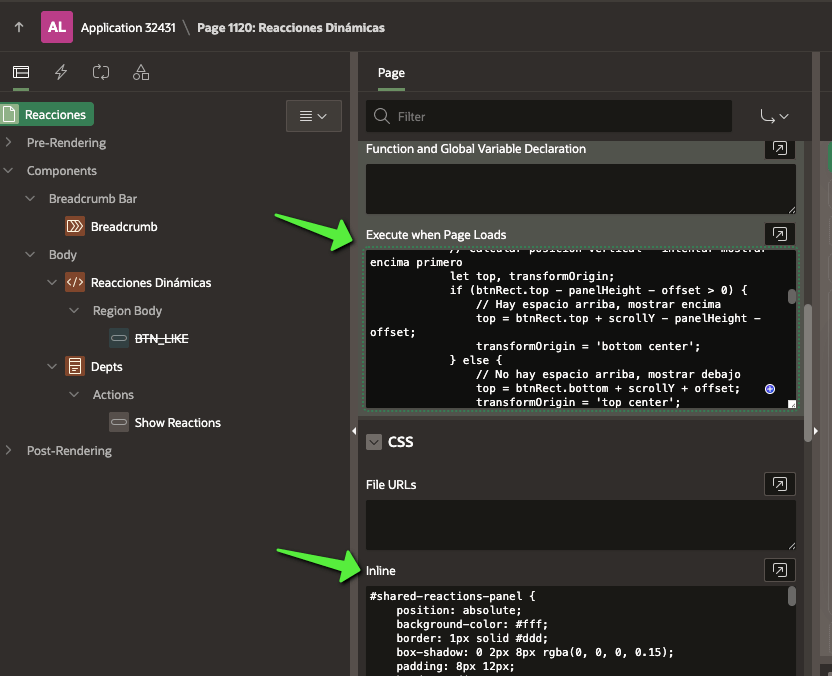
#shared-reactions-panel {
    position: absolute;
    background-color: #fff;
    border: 1px solid #ddd;
    box-shadow: 0 2px 8px rgba(0, 0, 0, 0.15);
    padding: 8px 12px;
    border-radius: 5px;
    opacity: 0;
    visibility: hidden;
    transition: opacity 0.2s ease-in-out, visibility 0.2s ease-in-out;
    z-index: 10000; /* Valor muy alto para estar por encima de elementos APEX */
    display: flex;
    gap: 8px;
    align-items: center;
    transform-origin: bottom center;
    pointer-events: none; /* Inicialmente no responde a eventos */
}

#shared-reactions-panel.visible {
    opacity: 1;
    visibility: visible;
    pointer-events: auto; /* Ahora sí responde a eventos */
}

.reaction-icon {
    cursor: pointer;
    user-select: none;
    display: flex;
    justify-content: center;
    align-items: center;
    width: 30px;
    height: 30px;
    border-radius: 50%;
    transition: transform 0.15s ease-in-out, background-color 0.15s ease-in-out;
}

.reaction-icon:hover {
    transform: scale(1.15);
    background-color: rgba(0, 0, 0, 0.05); /* Fondo sutil al hacer hover */
}

.reaction-emoji {
    font-size: 1.2em;
    line-height: 1;
}

/* Estilos para los botones que pueden tener reacciones */
.showReactions {
    padding: 8px 15px;
    border: 1px solid #ccc;
    border-radius: 5px;
    background-color: #f0f0f0;
    cursor: pointer;
    transition: background-color 0.2s ease-in-out;
    margin-right: 10px;
    position: relative; /* Importante para el posicionamiento correcto */
}

.showReactions:hover {
    background-color: #e0e0e0;
}

/* Estilo para el emoji seleccionado que se muestra en el botón */
.selected-emoji {
    display: inline-block;
    margin-left: 5px;
    vertical-align: middle;
}

/* Para pantallas táctiles/móviles donde hover no funciona bien */
@media (max-width: 768px) {
    .showReactions:active + #shared-reactions-panel,
    .showReactions:focus + #shared-reactions-panel {
        opacity: 1;
        visibility: visible;
        pointer-events: auto;
    }
}
function initReactions() {
    // Función principal que inicializa el panel de reacciones
    function initReactionsPanel() {
        const reactionPanel = document.getElementById('shared-reactions-panel');
        const triggerButtons = document.querySelectorAll('.showReactions');
        const hideDelay = 250; // Tiempo en ms para ocultar el panel
        let currentTriggerButton = null; // Para rastrear el botón activo

        console.log('Script de reacciones inicializado.');

        if (!reactionPanel) {
            console.error("Error: El elemento con ID 'shared-reactions-panel' no se encontró en el DOM.");
            return;
        }

        if (triggerButtons.length === 0) {
            console.warn("Advertencia: No se encontraron elementos con la clase 'showReactions'.");
            return;
        }

        // Función para posicionar el panel respecto al botón
        const positionPanel = (button) => {
            if (!button) return;

            const btnRect = button.getBoundingClientRect();
            const panelWidth = reactionPanel.offsetWidth;
            const panelHeight = reactionPanel.offsetHeight;
            const scrollY = window.scrollY || document.documentElement.scrollTop;
            const scrollX = window.scrollX || document.documentElement.scrollLeft;
            const offset = 5; // Ajuste de separación

            // Calcular posición vertical - intentar mostrar encima primero
            let top, transformOrigin;
            if (btnRect.top - panelHeight - offset > 0) {
                // Hay espacio arriba, mostrar encima
                top = btnRect.top + scrollY - panelHeight - offset;
                transformOrigin = 'bottom center';
            } else {
                // No hay espacio arriba, mostrar debajo
                top = btnRect.bottom + scrollY + offset;
                transformOrigin = 'top center';
            }

            // Calcular posición horizontal (centrado respecto al botón)
            let left = btnRect.left + scrollX + (btnRect.width / 2) - (panelWidth / 2);

            // Ajustes para evitar que se salga de la pantalla
            if (left < scrollX + 5) left = scrollX + 5;
            if (left + panelWidth > window.innerWidth - 5) {
                left = window.innerWidth - panelWidth - 5;
            }

            // Aplicar posición
            reactionPanel.style.top = `${top}px`;
            reactionPanel.style.left = `${left}px`;
            reactionPanel.style.transformOrigin = transformOrigin;
        };

        // Mostrar el panel
        const showPanel = (button) => {
            if (!button || button === currentTriggerButton) return;

            clearTimeout(reactionPanel.hideTimeout);
            currentTriggerButton = button;

            // En APEX, es mejor mover el panel al final del body para evitar problemas con contenedores
            if (reactionPanel.parentNode !== document.body) {
                document.body.appendChild(reactionPanel);
            }

            positionPanel(button);
            reactionPanel.classList.add('visible');
        };

        // Ocultar el panel
        const hidePanel = () => {
            clearTimeout(reactionPanel.hideTimeout);
            reactionPanel.hideTimeout = setTimeout(() => {
                reactionPanel.classList.remove('visible');
                currentTriggerButton = null;
            }, hideDelay);
        };

        // Configurar eventos para botones trigger
        triggerButtons.forEach(button => {
            button.addEventListener('mouseenter', () => {
                showPanel(button);
            });

            button.addEventListener('mouseleave', () => {
                hidePanel();
            });
        });

        // Eventos para el panel de reacciones
        reactionPanel.addEventListener('mouseenter', () => {
            clearTimeout(reactionPanel.hideTimeout);
        });

        reactionPanel.addEventListener('mouseleave', () => {
            hidePanel();
        });

        // Manejar eventos de redimensionamiento para reposicionar el panel si está visible
        window.addEventListener('resize', () => {
            if (currentTriggerButton && reactionPanel.classList.contains('visible')) {
                positionPanel(currentTriggerButton);
            }
        });

        // Manejar eventos de scroll para reposicionar o cerrar el panel
        window.addEventListener('scroll', () => {
            if (currentTriggerButton && reactionPanel.classList.contains('visible')) {
                positionPanel(currentTriggerButton);
            }
        });
    }

    // En Oracle APEX, es buena práctica usar esta comprobación
    if (typeof apex !== 'undefined') {
        apex.jQuery(document).on('apexreadyend', initReactionsPanel);
    } else {
        initReactionsPanel();
    }
};

initReactions();
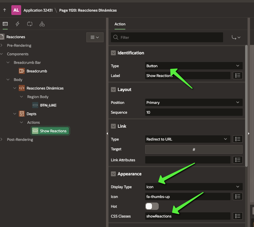
El HTML dependerá de cuándo y cómo deseamos mostrar las reacciones en la interfaz. Como ejemplo, utilizaremos botones personalizados y un reporte de “Departments” para ilustrar cómo interactuar con los datos en Oracle APEX.
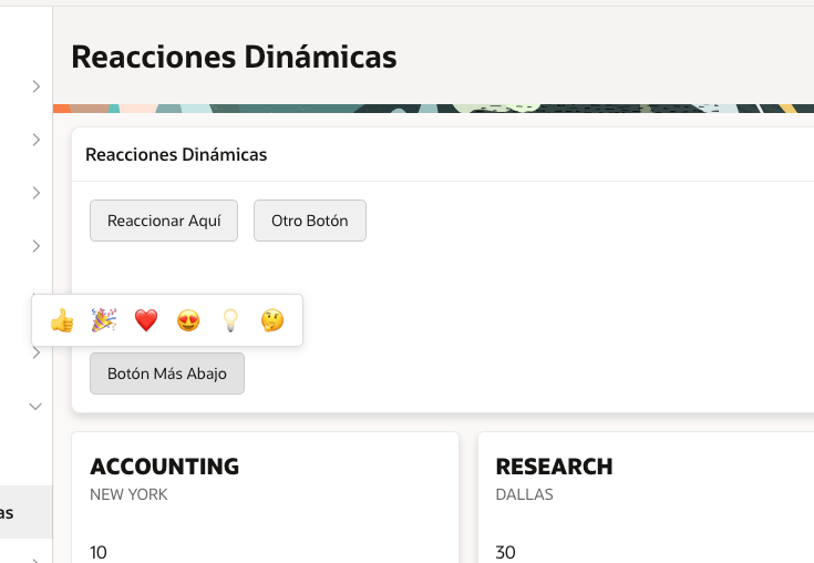
<div id="shared-reactions-panel" class="extended-reactions">
    <div class="reaction-icon like" title="Like"><span class="reaction-emoji">👍</span></div>
    <div class="reaction-icon celebrate" title="Celebrate"><span class="reaction-emoji">🎉</span></div>
    <div class="reaction-icon support" title="Support"><span class="reaction-emoji">❤️</span></div>
    <div class="reaction-icon love" title="Love"><span class="reaction-emoji">😍</span></div>
    <div class="reaction-icon insightful" title="Insightful"><span class="reaction-emoji">💡</span></div>
    <div class="reaction-icon curious" title="Curious"><span class="reaction-emoji">🤔</span></div>
</div>


<button class="showReactions">Reaccionar Aquí</button>
<button class="showReactions">Otro Botón</button>

<div style="margin-top: 100px;">
<button class="showReactions">Botón Más Abajo</button>
</div>
El resultado final es:

 aflorestorres.com